When Minimalism Meets Mid-Century Modern
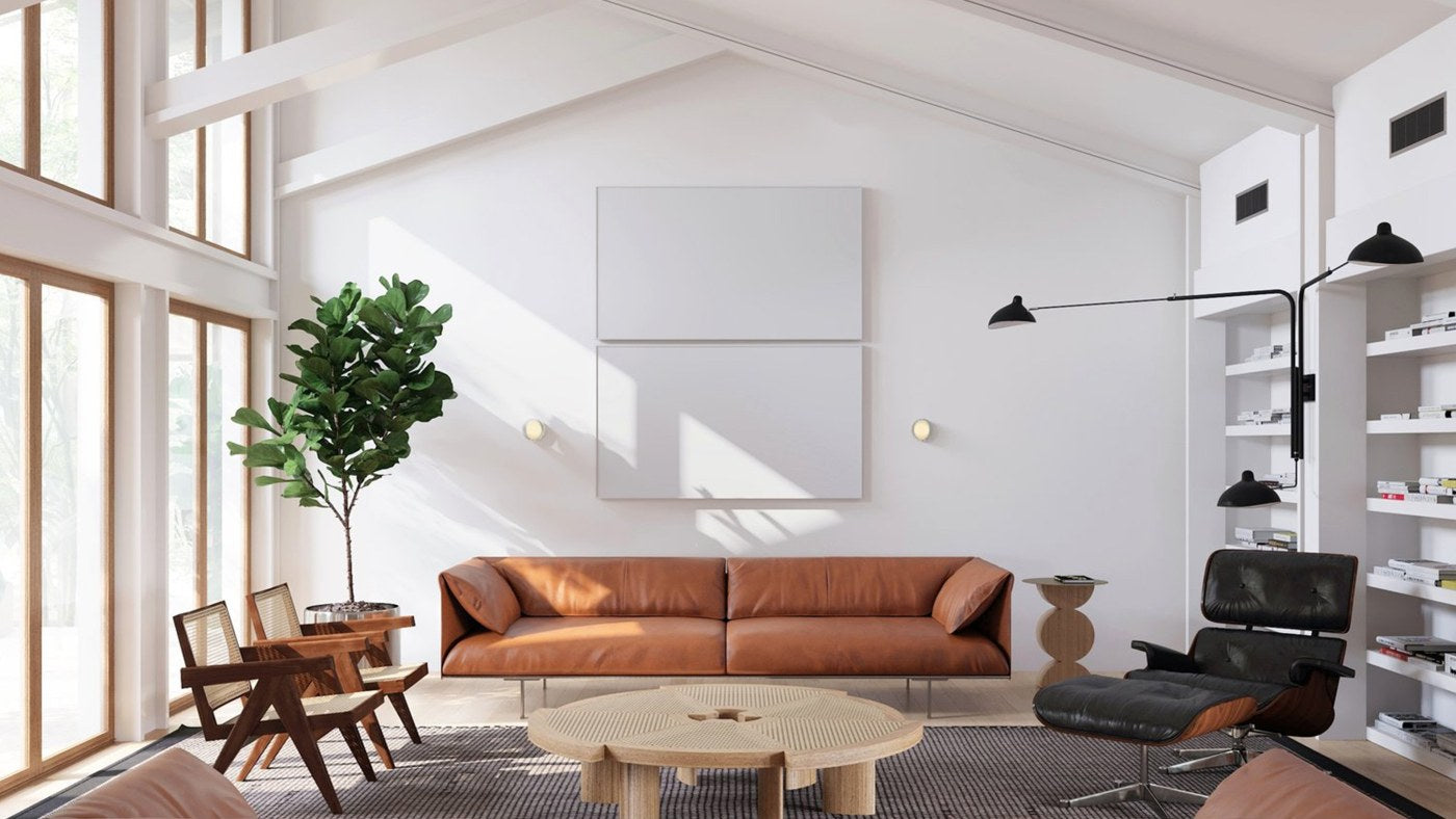
Image above: Interior designer Artem Trigubchak’s project in Dallas is a mesmerising marriage between minimalism and mid-century modern, balancing the vintage and the new.
The amalgamation of mid-century modern and minimalism is a sustainability match made in heaven, and what's better than an array of vintage lighting at your fingertips? Our new Minimalism Meets Mid-Century Modern lighting collection features salvaged lights with big stories to tell… We delve into the two design movements behind our latest collection - and how to achieve the look at home.
Born during times of political uncertainty and huge cultural shifts, mid-century modern and minimalism are two design movements that at first glance might not seem to go hand in hand. But the pairing makes for an enduring style that is a favourite of our lighting design and styling experts here at skinflint.
With its roots in the German Bauhaus design school, mid-century modern style stretched from the 1930s-1970s, finding its feet in the spacious post-war homes of young American families. Desperate for a fresh start after the war, they fully embraced the clean, organic, non-fussy aesthetics the Bauhaus designers brought with them to the United States. Tensions caused by the Cold War produced a society eager to embrace modernity and innovation, and technological advances boomed. Designers like Charles and Ray Eames were keen to utilise these new technologies, using innovative methods to create smooth organic forms using plywood and plastic.
Meanwhile, emerging at the tail end of the 1960s, minimalism was a flat-out rejection of excess. Designers began to create open spaces with minimal additions, to accentuate architectural features rather than unnecessarily filling a space up with surplus decor. Some cite German-American architect and furniture designer Ludwig Mies van der Rohe as being the first leader of minimalist design, and his basic, yet striking structures are constructed simply to maximise space and a feeling of openness.
Creating an authentic sense of accumulation is key to a mid-century minimalist space that takes a great deal of thought and attention. In a world where sustainability is becoming more desirable, these core principles ring very true. But by keeping the emphasis on texture and organic shapes, together with our advice below and our Minimalism Meets Mid-Century Modern lighting collection, you’ll be well on your way to creating your mid-century minimalist space.
Make a statement
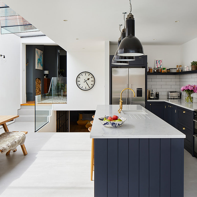
These two aesthetics are about making bold choices… but not too many! Whether it's a sizable light fixture, or an eye-catching piece of furniture, you want it to stand out rather than being swallowed by other fixtures in the space. Take for instance Shacklewell Architects' use of our 1930s German factory lights over a kitchen island in their Sailsbury Road home (above), where the large industrial scale of the pendants creates a striking visual and a point of interest, whilst functionally illuminating the workspace below.
Pieces with purpose
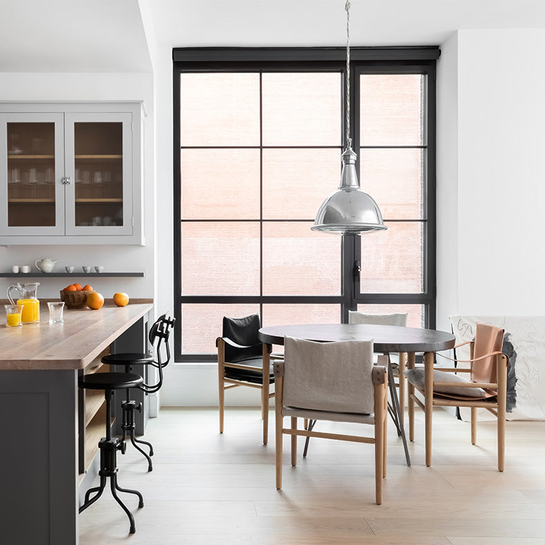
Mindful choices are paramount in creating a true mid-century minimalist space. Why are you choosing this particular piece? How will it function? Is it adding anything to the space? Every item should have a purpose, whether it’s to highlight an element of the room or have a practical use. For example, lighting above a kitchen island or a dining table, as seen with our 1950s Benjamin pendant lights in Plain English’s Manhattan Townhouse. Multiple-use furniture pieces, for instance, a coffee table with drawers are a handy addition to a mid century minimalist space - particularly for hiding those useful (but sometimes unsightly) odds and ends!
Mixing materials
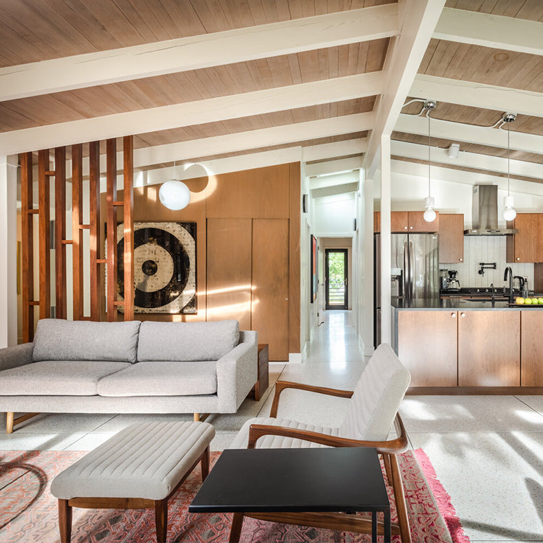 Above: Arc Den Studio’s fitting refurbishment of this original mid-century home incorporates a range of mixed materials to add interest and warmth.
Creating a subtle range of different finishes and textures is key to creating a successful mid-century minimalist interior. Think the clean lines of our opaline pendant lights contrasting against textured wood panelling, with the added bonus of casting a beautiful warm, soft light in the evenings when illuminated. Or the clean finish of a polished concrete floor with a refurbished piece of vintage furniture, or a unique antique rug. Mixing new and old has no rules, have fun with it!
Open up
 Image above: A breath of fresh air in this vibrant open-plan kitchen by Philip Stejskal, a perfect blend of mid-century and minimalism.
Minimalism is all about letting the space speak for itself and mid-century - whilst favouring larger spaces - veered in favour of filling them with functional pieces. So combining the two styles is a delicate balance. Separating a large space with feature pieces such as a striking floor light is a great way to create smaller ‘zones’ fit for different purposes, whilst conveniently bringing the mid-century look into a vast minimalist space. Need help finding the perfect fit? You can find our range of vintage floor lights here.
Create soft contrasts
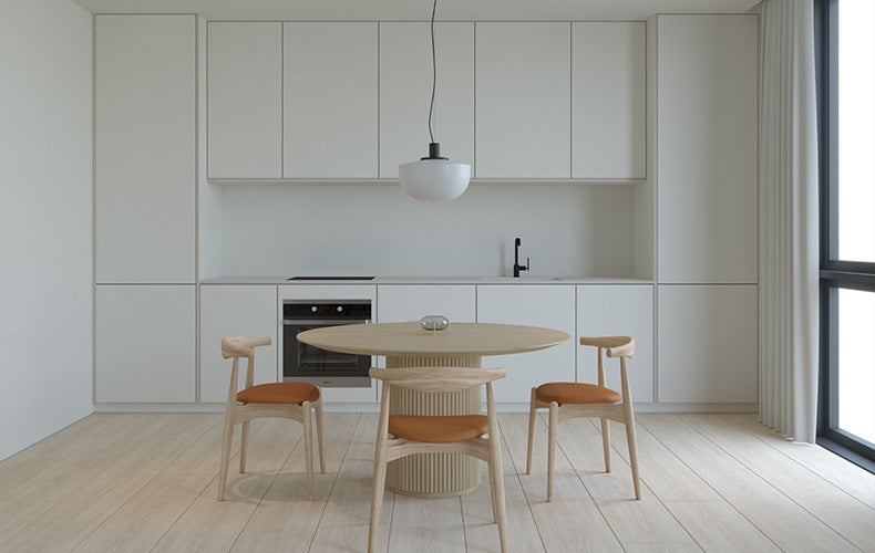 Image Above: Minimal with a touch of mid-century charm and in this clean-lined dining room by Mohamed Mousa.
The true division between mid-century modern from minimalist design is the use of bolder and more dramatic contrasts. Minimalism, however, takes a more subtle angle, making use of different textures and similar tones of colour to create diversity in a space. When combining the two, these contrasts can still be made, but with an added touch of softness. Choosing a lighter wood to pair against a white surface, or a pair of Double headed retro opal wall lights against a block colour wall is a great way to break up a space without it feeling too busy.
With all that in mind, have fun creating your stylish mid-century minimalist space!
You might also like
Creative ways with vintage enamel pendant lights
The skinflint team share their favourite ways to get creative with the vintage classic - from hanging at asymmetric heights, to playing with different flex colours, suspension methods and more.
Lighting adviceOur top 5 circular economy initiatives
It’s been 12 months since our Full Circle product buy-back scheme launched - and we’ve been blown away with the response. Feeling inspired, we share our favourite innovative companies using circular initiatives to change the way we think, use and consume.
Sustainabilityskinflint gift vouchers
Our newly launched gift cards are now available for purchase! Available to use on our entire range of vintage lights; our vouchers are the perfect gift for the eco-conscious.
News